We are exactly 24 days into our project and it's insulation day. Wow, we have come a long way in just over 3 weeks. I reminded Jeff that on our last project, we had our electrical inspection while we were in the hospital having our first daughter. Yes, Jeff left the hospital shortly after her delivery in order to meet the inspector. Remodeling really is glamorous! ;-) My point? Our beautiful baby girl was born September 1st. Start date for that project? May 26th. What does that mean? Took us 3 months to get to our electric inspection. We are kicking remodeling booty this time!
As of yesterday, the only outstanding items before the drywall can start on Monday were:
- Finish framing the arches (there are two of them: one between mudroom and kitchen and one between kitchen and family room)
- Insulate the walls
- Pass the insulation inspection
As of today, there is only one outstanding arch, here's a shot of the one between the kitchen and mudroom:
And the insulation? DONE!
I had to speed up to the house this morning at 8am because I received word that our exterior trim and new front/back door were ready to be delivered. Despite me requesting an hour's notice so I had ample time to get the kids packed up and in the car, they called when they were where? At the door. Boo. So I sped up there while Jeff waited at home with the kids (ultimately leading him to have to take the kids WITH HIM to work since my delivery boy seemed unimpressed with my speeding skills and in turn moved at the pace of a turtle unloading my goods). Thanks dude! Anyway, had to share that to keep these remodeling stories true to life. We are hardly enjoying living out of our cars these days. However, I must admit, it felt good to have all the materials ready and waiting:
However, because I was up to the house this morning at the crack o' my dawn, I was able to talk to the insulators and get some in-progress shots.
The only insulation that is required by code is on the exterior walls. Our house has 2x4 walls, homes built these days have much deeper walls and hence much more room for insulating those puppies. The great news for older homes like ours is that they make a product called spray foam (no idea if this is the technical name or not). Spray foam is great for uber skinny areas like our walls since we can get more density and efficiency with a layer of spray foam than we could with a whole mattress of bat insulation. Here's a close up shot of it:
Spray foam requires a professional installation (there are ways you can rent the machinery to install it yourself, however, we weren't exactly up for the challenge) and while we had them there, we decided to just go ahead and have them insulate the ceilings as well. The primary reason for doing this is for the purpose of sound dampening. We didn't think to do this on our last project, and regretted it after the fact. So it was priority numero uno when we decided to take the ceiling down in this house. With the kids bedrooms directly over head of our main entertaining area, there's no question we will get our money's worth out of this.
We have a 7:30am insulation inspection tomorrow and with that my friends, it's time to get the rock up. Now is when the real fun begins as the finishing work gets underway and the color and texture of the house start to appear. Next week is another biggie with drywall starting on the interior and trim and siding starting on the exterior. I can hardly wait!
Thursday, March 31, 2011
Wednesday, March 30, 2011
Details, Details, Details!
There has been lots of detail orientedness going on at the house this week. With the impending deadline of drywall starting on Monday, making sure everything is fine tuned inside the walls is of the utmost importance. This morning at 8:30am was our final building inspection before we begin insulating tomorrow...wow! I can't believe it!
I had Susan our architect meet me at the house on Monday for 3 reasons. 1) To walk through the sub-contractor rough-ins to make sure everything was properly placed 2) To address some questionable areas in the mudroom with cabinetry, trim and door sizes and 3) To help me dimension out the exterior brackets so I can get them ordered.
Allow me to elaborate on the mudroom conundrum...
As you can see from this elevation drawing, the two different elements of cabinetry and the two different doorways on this particular wall in the mudroom are all supposed to be at the same height. The only currently existing of these elements is the doorway between the shoe cubbies and the charging station. This is the doorway that leads down to our basement.
The idea was to build the other elements to match this doorway (since raising that doorway isn't an option with the upstairs stairway directly overhead). However, the door height down to the basement is not a standard height...but rather considerably shorter (6'8" is standard, this was more like 6'4"). Now while this door height makes sense for the basement considering everything going on above it, having the door height match this into our most used bathroom doesn't really make sense. While it's true both Jeff and I only DREAM of soaring to such heights, we do have friends and brothers who were gifted with such elongated appendages that it actually would become an issue. There's nothing worse than directing a guest to your bathroom and following it up with "WATCH YOUR HEAD!" So, the question became how do we make sense of these elements that all share the same wall space, but are of different heights. Here's how we (and by 'we' you know I'm referring to our fantastic architect Susan) resolved the issue.
After we decided to keep the bathroom door at 6'8", it became a puzzle of figuring out how to make the remaining three elements seem like one. We first explored the idea of joining them all together with trim, so running one long piece of trim across the top of all three elements vs trimming each one out individually. However, we ran into issues stemming from the particular trim profile we chose and how different areas would join together leading us to quickly veto that idea.
The next idea we (Susan) came up with meant trimming each piece out individually, but filling the empty wall space between each element with the look of a cabinet panel. So basically, making the three separate elements appear as one large built-in unit spanning the entire wall space hence keeping the taller powder room door as its own entity. Brilliant! This is the idea we ultimately settled on and after she quickly sketched it on a nearby 2x4 for reference, we were on to our walk through. Here's my 1st grade interpretation of how it will look (I even autographed the photo as my drawing skills are sure to take me places!)
This is a perfect opportunity to once again bring up the importance of an architect on a remodel. I truly believe that what distinguishes one home from the next are these minute details that make your home really special. Now I completely understand that everyone's priority isn't necessarily to extract creative thinking in every solitary surface of their home, but why not customize your space with personal touches that make a lasting impression on you and yours. Amidst the chaos of construction, its easy to take the simplest option rather than taking the time to think through the alternatives. Had Susan not been at my fingertips, I most certainly would have forged ahead on this space without first tying up the loose ends.
Remember the nuky sisters?
Well, they are no longer. Gloria is the squirmiest creature known to mankind with her determination to crawl despite generous sized abdominal cavity. Here's the best picture I could get of the newly nuky-free sisters!
And here's what the rest of them looked like:
Tuesday, March 29, 2011
A Tradition In The Making
While here, I am mostly known as a general contractor mom, believe it or not, at times my interests take me outside of Home Depot and Babies R Us. I thought I'd take a break from bringing you all the latest on the wiring in our house to introduce you to a different kind of construction project we've been working on.
When Rosemary was born, Jeff presented me with a ring that was somehow meant to bridge the gap between sacrificing my body to some extreme greater power that could only have been attempting to kill me and giving him the gift of fatherhood. We didn't know if Rosemary was a boy or a girl, so when it turned out she was a girl, he told me the ring was for me to give her on her wedding day...or whatever day we decided seemed like the right time. I humbly accepted his gesture despite its inability to erase the stretch marks from my abdomen and had the ring engraved with her name and birth date. My plan is to not really ever tell her the story of the ring until we give it to her. I think it would be a really special surprise...especially on whatever important day we share it with her.
When Gloria was born, Jeff gave me a teeny, tiny zip-loc bag with a few microscopic diamonds in it. Being that it was our second daughter, he told me to continue the tradition and use the diamonds to make a ring for her. We've had the diamonds just sitting at our house for the past 10 months as I've lacked any and all inspiration to take up jewelry making amidst my general contracting. However, a few months ago, I came up with an idea for her ring and have been mulling it over in my mind. Finally a few weeks ago, I told Jeff I had an idea and that I was ready to pay the jeweler a visit with my inspiration image. Brace yourself, here it is:
At this point I am fully aware that you think I've jumped off the deep end...but stick with me here. What about a bow ring? I have spent the past few months Googling my heart out trying to find the perfect bow...and then I came across this image. The scale is all wrong, the design is all wrong...but I absolutely love the style of this bow. I love how elongated it is, how it isn't tapered at the center or 'cinched' tightly. I love how it feels a little floppy and a little casual. Not a uber tailored, 'cutsie' bow like this ring:
I was a little disappointed to find out Tiffany's actually makes a bow ring (I stumbled across it at a display window and scoffed aloud). It's a beautiful ring, but doesn't scream 'antique' like I'm going for. Here's their version:
I had about 30 different bow images saved on our desktop before I finally just accepted that my inspiration image above, while it may look more like a headpiece than a ring, is what I'm really going for.
So we talked to the jeweler for all of about 10 minutes trying to give him enough to go off of. I have no idea what I'm envisioning the finished product to look like...I just know I like the feel of that headpiece...I mean, ring. The design process includes computer images followed by a wax mold of the actual ring prior to it actually being made out of the selected materials. Last week, we were able to see the computer images and in all honesty, my heart sunk a bit when I saw them. While I can't exactly pinpoint what it is I'm going for, what I saw wasn't the AHA! moment I was looking for. So we made some adjustments and hopefully this next round of revisions will bring us closer to the feel I was looking for. Stay tuned for images of the wax mold of the ring set to be ready next week.
Saturday, March 26, 2011
Twin Cities Notables revisited
Internal struggle #263: Can I add contractors I am currently working with to my Twin Cities Notables list if I haven't seen the end result. Verdict? No.
I have a handful of names I'm just dying to shout from the rooftops, but I don't feel it's fair to you to add them to my list until I've seen the finished product. Allow me to elaborate (because you know I love to). We've had some pretty fantastic sub-contractors we've been working with, specifically, plumbers, HVAC technicians and electricians. And while all of their rough-in inspections are complete and passed with flying colors, I am yet to see an ounce of finishing work take place as we aren't quite at that point. While what goes on in the walls is arguably MOST important - some might argue that what matters even more is how it looks when it's finished. Things like: proper faucet and drain installation, perfectly placed and grouted tile, properly hung light fixtures, etc. So until I've seen these details executed in a way that could only deem them worthy of such a prestigious title, they shall remain in the next best place - this blog post.
You should always proceed with caution when hiring someone to work on your home - and even though you see them here doesn't necessarily mean that they are the right fit for your project. But might I suggest you give one of these fine craftsmen a call and offer them an opportunity to assist you on your next project.
Service: HVAC
Company: Hi-Tech Heating & Air Conditioning
Contact: Tim Holtman & Tom
Phone: (952) 292-5780
Service: Electrical
Company: Sky Electric
Contact: Rick Bokusky
Phone: (952) 888-1736
Service: General Contractor (He's doing our exterior but he also does interior work)
Company: JYJ Construction
Contact: Jon Jorud
Phone: (763) 551-3904
All of these professionals have exceeded our expectations to date and have made this remodeling experience...dare I say...pleasant. Here's to hoping they uphold this level of service and are deemed worthy of Twin Cities Notableness.
Rosemary and Gloria are both doing great these days. Rosemary is at such a fun(ny) age and with her new nuk free-ness, she seems to be talking twice as much as before (I didn't even know someone could be capable of talking as much as she does!) Gloria continues to have her fussy days with a sprinkle of good days mixed in. Her new tricks include Peek-A-Boo, saying "All done" and opening her mouth and saying "ahhhhhhh" to show you her teeth. She couldn't possibly be any cuter:-)
I have a meeting to get to with our architect shortly up at the house, so I shall leave you with a little video of Rosemary. We have been talking a LOT about school lately being that she's a "big girl" now that doesn't have a nuk and will start preschool in the Fall. If you listen in this video, she's actually riding this horse to "Kindergarten." So sweet!
Friday, March 25, 2011
Not your Grandmother's electric
While this week was huge at the house, to the untrained eye, nothing much has changed. However, from a contractor standpoint, the brunt of the work is complete. The HVAC (Heating/Air Conditioning), Plumbing & Electric have all been properly placed, run, secured, inspected, etc and the walls are nearing the point of being ready to close up for good. We didn't run into too many issues with any of the subs. We had to rework that bit of plumbing to accommodate the 4" wall shimmy between the kitchen/mudroom and we had a bit of an issue fitting in one of the 3" can lights we had planned for the kitchen due to some new duct work being in the way. But with a little creativity and collaboration, we were able to accommodate everything that we hoped for.
On our last remodeling project, we walked through the house with the electrician and literally made decisions as we went. This time, we had a proper electric plan for the electrician to follow to a T. Here's what that looks like:
Putting this plan together will really make sure things all make sense when the project is complete. There's nothing worse than realizing you needed an outlet for a TV in a particular spot or a switch for a particular area where you forgot one.
Being that Jeff and I fell a bit short on our electrical planning on our last project meant we had plenty of ideas where we could improve on this house. Allow me to share my favorite part about this new house so you can steal it for your own remodel project.
What you are seeing here is a shot of an outlet that will be installed in the front exterior overhang. Why you ask? FOR CHRISTMAS LIGHTS! I love hanging garland at Christmas time, but there's nothing worse than a blaze orange extension cord hanging from your perfectly lit display. So the lights can be plugged into the overhang - and we can turn them on from a hidden little switch in the front hall closet.
Brilliant! Is it sad that I'm counting down the days to Christmas decorating time? Don't answer that.
By the way, YES, the front entry overhang was framed. She's in the early stages, but she's on her way to fabulousity! Here's a wide angle of the house as it stands today:
Another creative idea we (I mean our fantastic architect Susan) had is this little nook that will be built out with cabinetry as a small charging/mail station in our mudroom.
So a special outlet was placed here to accommodate our cell phone charger, camera charger, etc. We put it on the side of the future cabinet as seen here because the back of the station will have a small pin-up board for messages, etc.
The electrical plan also called for 2 pendant lights over the kitchen bar (right under the new archway that will separate the kitchen from the family room). I went back and forth on these countless times and ultimately decided to go with 3" can lights instead of pendants (See? At the very top of the pic?)
You KNOW I love light fixtures, but this new arch will be so beautiful, not to mention the view out through the french doors and into the painted cabinetry in the kitchen. I felt like the pendants would really take away from everything that is so simple and charming about the house. So I decided to go with the smallest can lights available to keep them almost invisible.
A highlight of this week was a fantastic meal shared with two of our dearest friends - who also happen to be Rosemary's Godparents and one of Jeff's prized co-workers. Thanks for a fabulous night out Tim and Rachel!
Branching out
Ladies and gentlemen, we have a huge announcement over here at our house...nope, no new baby, nope, no new job, nope, no new house (thank goodness)...bigger than that! We are officially NUK FREE!!!!!!!!!! I have been dreading this day for longer than I can remember...well, actually since the day Rosemary was born...just 2 years and 7 months ago...the day I would have to finally cut my addict of a child off from her favorite newborn pacifier. Long story short, the deed is done. Gloria is 100% nuk free and Rosemary is down to a nuk JUST at bedtime. I feel like the weight of the world has been lifted off my shoulders. And although it absolutely BROKE my heart into a million tiny little fragments of pieces to have to take something from my daughter that she loved so much - it fell into the category of tough love (first of many) and had to be done. I think the whole experience has been most difficult on me. I can't tell you how many times I've run to the kitchen to just get the old nuky. Must. Remain. Strong.
So, since my oldest little buttercup is proving what a tough little girl she is, I wanted to do something special for her. That back wall of her bedroom is always on my mind for a perfect piece to give it a little personality.
The wall is quite substantial in size and needs a hefty piece, however, I'd be kidding myself if I thought I could actually hang something on that wall and have it not get pulled down by two of the cutest little hands I've ever seen.
I had an idea to do some sort of a tree branch. Yes, I know this sounds odd, but growing up, we had a Lilac tree in our front yard that my mom used to decorate for the holidays (lights at Christmas, eggs at Easter, etc). I thought it would be fun to integrate actual hooks into a vinyl decal of a branch so we could 'decorate' it for the seasons, holidays, occasions, etc. I found this one of a cherry blossom branch on Etsy. Of course you know I love birds, so I loved the idea of integrating those even more.
The colors are customized to your liking with three selections to complete your image (1 for branch and birds and 2 flower colors). I've thought of a couple different schemes - pulling out the pink and green in her rug, or keeping it all white or taupe to have it very subtle on the wall. The decal comes in pieces and you can arrange the flowers to your liking. I actually thought of just hanging the branch and birds to make our decorations we hang from the integrated hooks really pop. Whenever I get over to the house again I'll do a little staring to see what peeks my interest.
It's been a great week and we are so close to being able to move back into our house. As nice as it's been to avoid the mess over here at Grandma and Grandpa Schaffers' house, we are all a little home sick and ready to be back in our own beds...mess and all.
Wednesday, March 23, 2011
Weather Delay
Ever wonder what a weather delay looks like? Let me show you:
The exterior was on halt today while we reverted back to Christmas. Yes, it was Christmas in our house today as announced by Rosemary upon waking and catching a glimpse of the blustery snow storm outside. So we stayed pretty well planted today in an attempt to deny that there really was 5" of snow blanketing our almost melted existence. Let's hope this is short lived.
In the meantime, work continued on the interior with the electrician forging ahead in his quest for an ambient lit house. There are a few loose ends to tie up for all three subs prior to inspection day. But as it stands, everything is moving along on schedule.
The exterior crew plans to return tomorrow to frame the front overhang. VERY excited (and a little bit nervous) to see it come together. Of course it won't look complete without the addition of the decorative side brackets below each overhang. However, I'm waiting on ordering those until I see how the final dimensions measure up once the overhang is framed. I am ordering the brackets through Pro Wood Market. We purchased brackets for our previous house through them and I was incredibly impressed with their quality and timeliness (only a week to get them, and they are all custom made!) Here are the ones we are putting on this house under the front and back overhangs and cantilever.
Finally, you've often heard me refer to Gloria as a 'fussy' baby. Well, today, amidst one of her ear piercing meltdowns, desperation led me to place her in a box. No, not a covered box with a shipping label to Guam adhered (it crossed my mind;-), but rather a simple, clear plastic tub filled with toys for her to crawl around in. Let's just say, the plastic tub now sits upon a pedestal in our house. It was so fun watching her play and actually enjoy herself for a few moments!
Tuesday, March 22, 2011
4" makes ALL the difference
In the remodeling world, an inch can be the equivalent of an ounce of gold. Ok, that really doesn't make sense, but my point is that when you are dealing with an old home and trying to work with what you have, an inch, or in our case 4, can make a world of difference. Allow me to explain.
In our new kitchen, there are several 'fixed' pieces, meaning elements of the space whose location can not be compromised. The main one I'm referring to here is the stove. Because of the way the arch falls, and because we want to keep the stove disguised from the dining room behind an actual wall (which also makes it easier to vent), the stove must remain in the exact spot you see it drawn here. Capeshe?
Well, when I went to order the refrigerator, I assumed Werner Stellian was my oasis and I should choose whatever refrigerator tickled my fancy. Upon further inspection (and after my debit card had already been swiped), I realized the plans called for a 30" refrigerator and not a 35 1/4" refrigerator like I bought. Whoopsie Daisy.
So we started working backwards within the space that was created for the kitchen with an equation that goes something like this: space we have (minus) dimensions of stove (minus) new oversized refrigerator = too little counter space between stove and fridge. After working through the equation and borrowing X from Y, we were left with just 14 measly inches between stove and fridge - that's not very much (que you holding up your hands 14" apart). 18" however, would be much more ideal. So what do we do to gain that extra 4"? Let's all say it in unison...'MOVE THE WALL'!!!!!!!!!
Is it possible? Yes. Is it ideal? No. Is it worth it? Beauty is in the eye of the beholder and I beholdeth that it is indeed worth it, primarily for the reason of keeping that side of the kitchen from looking too weighted down with stainless steel. A refrigerator and stove on top of eachother isn't ideal and gaining that extra 4" to give my mixing bowls a bit of breathing room gave me the courage to call up the respective framer to shimmy that wall right on over. Of course, nothing is ever that easy...and being that the plumbing had already been run through that wall, it means getting the plumber back over to the house as well. Que the wrist slap.
In the end, it's these tiny little adjustments that make a world of difference. And once the walls are closed up and the cabinet maker takes his final measurements, these decisions are final. Speak now or forever hold your peace!
Monday, March 21, 2011
Budget Busters!
They are inevitable. Those sneaky little expenses that like to creep up on you and take complete advantage of your intricately composed budget. Being quite well versed in the budgeting department (I LOVE DAVE RAMSEY), I of course wouldn't set foot in a construction zone without a finely tuned budget on hand. But even with all our [my] planning, there's no way of predicting the unpredictable expense. There is, however, a way of drawing the line.
Budget Buster #1
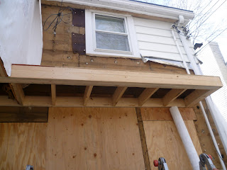
The overhang was framed today that acts as a little shelter over the back door and also helps to tie in the odd cantilever.
It's looking absolutely fabulous and has completely changed the look of the back of the house...except for one thing.
DARN YOU ELECTRIC METER (see that white box to the right of the overhang). The eye sore of an electric meter that sits on the back of our house is sticking out like an absolute sore thumb. Somehow, with the addition of this overhang, the blasted meter seems to have morphed into a virtual power plant on the back of the house. So the options presented themselves:
A) We are putting all of this time, money and effort into completely renovating this home, WHY would we leave this eye sore in the most visible location possible (remember our new back door will be just inches to the left of this meter)? Let's bury the power lines and move the electric meter out to the garage.
B) Forget digging up the yard to bury the power lines 3 feet below a perfectly decent lawn, let's just move the electric meter to the side of the house and leave the power lines as is.
C) Forget it. Let's leave the electric meter where it is and hope that once all the pipes that hold the wires are painted, it will blend right into the body of the house.
And the verdict is? [...Blank space here while you decide what your guess is...] C!!!!!!!!!!!!!!! Leave it exactly as it is and blend that puppy right into the house by painting it out.
The thing is, we live in Minneapolis. Virtually every home in our area has an electric meter on it. And while it would be nice to have our yard free and clear of power lines, burying ours ain't gonna eliminate the big ol' power pole in the middle of our alley. And by saving the money on rearranging our personal power plant, we will be putting the funds towards a security system upgrade. Our house already has a security system, but it's LITERALLY one of the original security systems known to mankind (aside from a big old hairy beast on your front stoop). So saving the funds on the electrical will give us the opportunity to make sure our purrrty new house is also one we feel safe in.
And finally, just to give you an idea of what kind of funds we were dealing with here, moving the electric meter out to the garage and burying the power lines would be more than $5000. Moving them to the side of the house would be close to $3000. We truly don't believe these would be funds we could recover, so at the end of the day, we believe this is the smartest decision we can make...not to mention we can upgrade our security system for a tiny fraction of that price. Oh no you don't budget buster!!!!!!!!
Saturday, March 19, 2011
Look Who's Here!
Our bed!
Miss Mendocino (actually, her knock off from eBay) arrived last week and finally was assembled thanks to our anniversary. In other words, it took us getting a babysitter and sneaking out for an evening in order to assemble something without 4 extra little hands around to steal all of the necessary hardware!
It was super easy to assemble and is truly a perfect addition to our bedroom. For now, this is all the furniture we will be putting in this room. I do feel that down the road, we could definitely use an additional small dresser. At this time, Jeff and I are sharing a sock drawer and he has some clothing items stored in his nightstand. It'd be nice to have another 4-6 drawers for ample storage. Here are a few that had me swooning from the latest Restoration Hardware catalogue:
All of the above dressers are a pretty penny, so obviously these would serve as inspiration for something I might find off Craigslist...or maybe hit another amazing deal on eBay. 'Full Price' just isn't my middle name;-) For now, the room has evolved QUITE drastically over the past couple of months. Remember my old ironing board side table?
I can't wait for the dust to settle so I can put all the bedding together. And start getting some pieces hung on the wall.
Remember I was considering this light fixture for our bedroom?
I love this style of chandelier, but the dimensions definitely aren't going to work in our room. Not even so much dimensionally, but rather the placement of the fixture on the ceiling. If it was centered over the bed, it'd be one thing. But having a light hanging that low right near the foot of the bed is pretty awkward. The search continues. Perhaps this would be a nice statement light for the main floor powder room though??? Once the drywall is up, I think I'll get a better feeling for if the scale is OK for that tiny little room.
Last week at the house finished up strong with the installation of the front two windows, the framing of the new back door (which is now all set for door install once it's delivered next week) and the wrapping of the house in Tyvek.
The exterior crew will be back again next week to frame the exterior overhangs and finish closing up the side door and replacing it with a small window instead. From there, they'll be working on other jobs until our siding and trim arrive.
Jeff and I had a wonderful weekend celebrating our wedding anniversary. Rosemary is at a hilarious age where she borders on being somewhat cooperative - but is still very much our baby. She took this picture of Jeff and I on our anniversary (how grown up of her!) and wished us a happy anniversary about 100 times. The angle of the picture cracks me up!
Subscribe to:
Posts (Atom)